The Awkward Silence After the Big Reveal
You've spent days, maybe weeks, cleaning, modelling, and analysing. You've built the perfect dashboard. The numbers are accurate. The trends are clear. You present it to leadership with confidence.
And then... silence.
A polite nod. A vague "interesting." A quick pivot to the next agenda item.
Sound familiar?
This is the hard truth no one tells you in data science bootcamps: data does not speak for itself. You can have the most pristine dataset on the planet, but if you can't tell a compelling story around it, your work will gather dust in a shared drive.
This isn't about dumbing down your analysis. It's about respecting your audience's time, attention, and decision-making reality.
In this post, we'll explore why most data presentations fail, how to structure insights for real impact, and a simple 3-question framework that will make your next meeting unforgettable—for all the right reasons.
The Three Deadly Sins of Data Presentations
Before we talk solutions, let's name the enemy.
1: The Data Dump
This is the most common mistake. You project a dense table with 47 columns, walk through every single number, and assume your audience will connect the dots. They won't. Decision-makers don't need all the data. They need the right data: filtered, summarized, and translated into plain English. Before your meeting, ask yourself: "If my audience remembers only three things from this presentation, what should they be?" Build your entire narrative around those three things. Everything else is an appendix.
2: The "Trust Me" Approach
You show a chart. You say, "There's a clear trend here." You move on. But your audience isn't convinced. They're squinting at the axes. They're wondering if you cherry-picked the timeframe. They're silently calculating whether this aligns with what they saw in last month's report. Don't just state conclusions; show the why behind them. Walk through your logic briefly. Acknowledge limitations honestly. When you preempt their doubts, you earn their trust.
3: The Action Vacuum
This is the most fatal sin of all. You present a fascinating insight: customer churn spikes after month three. Then you stop. Your audience thinks: "Okay... so what do I do with that?" All insight must be paired with a clear, actionable recommendation. Even if you're not 100% sure, offer a hypothesis. Decision-makers crave direction, not just information.
The 3-Question Framework for Impactful Storytelling
Here is a simple structure that works for any audience, any industry, any dataset. Memorize these three questions and build every presentation around them.
Question 1: What Changed?
Start with the headline. What is different now compared to last week, last month, or last year? This is your hook. It grabs attention because the human brain is wired to notice change. If nothing changed, why are we meeting?
Example: "Our customer acquisition cost has increased by 22% over the past six months."
That's a statement that demands attention. It's specific. It's measurable. It begs the next question.
Ready to go further?
Master these skills in 10 weeks
Our certified Data Analysis program covers everything in this article and more. Live instructors. Real projects. Job support.
Enroll NowQuestion 2: Why Does It Matter?
Now translate the change into business impact. Don't assume your audience will connect the dots—connect them yourself.
Example: "At this rate, we'll overspend our marketing budget by $400,000 by year-end unless we intervene."
Now it's not just a number. It's a threat. A risk. A problem that needs solving.
Question 3: What Should We Do About It?
This is where you earn your paycheck. Offer a clear, evidence-backed recommendation—even if it's just a starting point for discussion.
Example: "Based on our analysis, shifting 30% of our ad spend from social to search could reduce CAC by 12% within 90 days. We recommend a two-week test to validate this before committing."
You've just given your audience a path forward. Not a demand but a proposal. That's the difference between being a reporter and being a strategic partner.
Why Storytelling Is a Competitive Advantage
This is something most analysts don't realise: technical skills are table stakes. Anyone can learn SQL. Anyone can watch a YouTube tutorial on regression analysis. But the ability to translate complex data into a compelling, action-oriented narrative? That's rare. That's valuable. That's how you get promoted.
Think about the best meetings you've ever attended. I'll bet they weren't the ones with the densest slides. They were the ones where someone said something that made you think differently, feel something, or want to act.
Data storytelling is not about manipulating the truth. It's about honouring the truth—and making sure it lands.
Practical Tips for Your Next Presentation
Let's get tactical. Here are 5 things you can do tomorrow to improve your data storytelling.
- Start with the Bottom Line: Put your main conclusion in the title of your first slide. Not "Q3 Performance." That's a label, not a takeaway. Instead: "Q3 Revenue Grew 8%—But Margins Shrank 3 Points." Your audience now knows exactly what you're talking about before you say a word.
- Limit Your Charts: One chart per insight. Three charts per presentation max. If you have more, move them to an appendix.
- Use Plain Language: Avoid jargon. Don't say "leveraged a cohort-based retention model." Say "customers who joined in January are staying longer than those who joined in June."
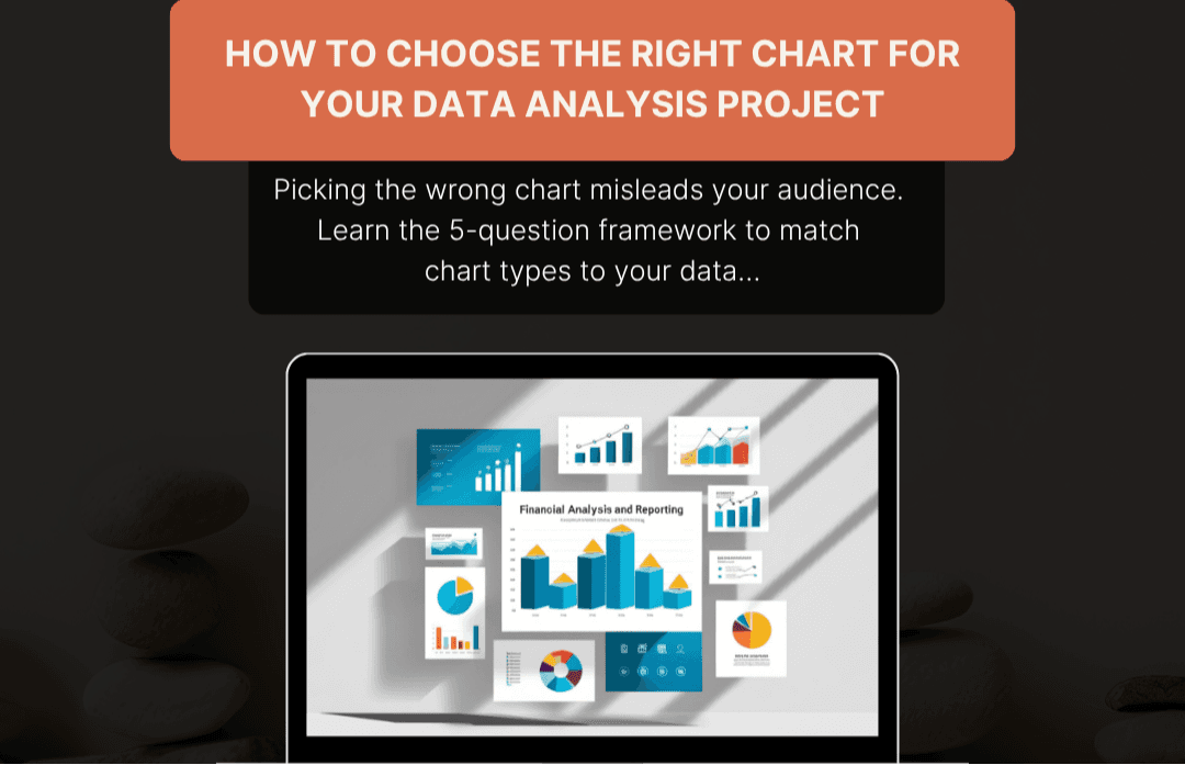
- Make It Visual but Not Flashy: Use bar charts for comparisons. Line charts for trends. Tables only for exact numbers. And ditch the 3D effects. They don't impress—they distract.
- End with a Clear Ask: Don't let your final slide be "Questions?" That's passive. Instead, end with: "We recommend approving a two-week test. Do we have consensus on this?" You're not just presenting. You're driving decisions.
The Real ROI of Better Storytelling
When you communicate clearly, good things happen:
- Faster decisions. Leadership spends less time decoding your charts and more time acting on them.
- Fewer follow-ups. You won't get six emails asking for clarification after the meeting.
- More trust. Stakeholders invite you to earlier conversations, not just the post-mortem.
- Career growth. You become the person who doesn't just have answers, but drives action.
None of this requires advanced math. It requires empathy, clarity, and the discipline to put your audience first.
Data Is the Raw Material and Story Is the Product
You work hard to get the numbers right. That matters. But numbers alone are like bricks. Beautiful, solid, and completely useless until someone builds something with them.
You are the builder. The architect. The translator between raw information and real-world decisions. So the next time you sit down to prepare a presentation, don't ask: "What data do I have?"
Ask: "What do I want my audience to think, feel, and do after they hear me?"
That shift, from data-first to audience-first, is the single most powerful change you can make in your career.